
Toast 2022
Buffet select component
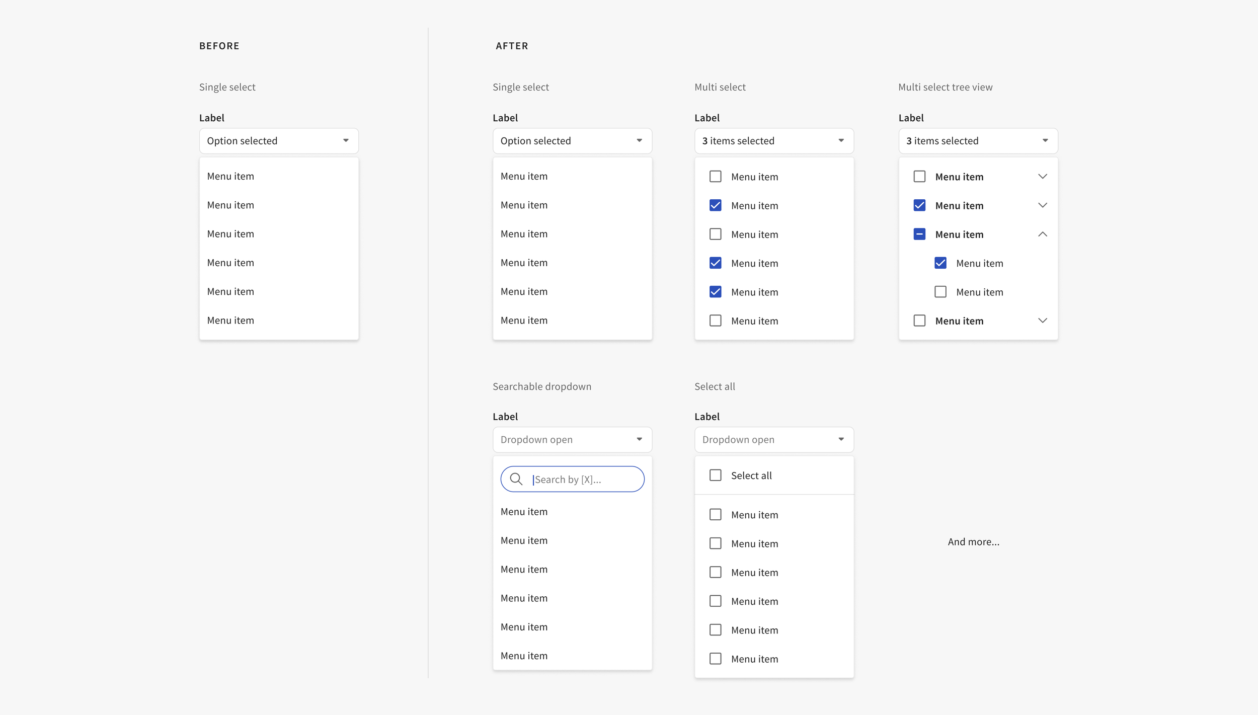
The select component is one of the most used components in the Buffet design system, with tens of thousands of instances found in Figma and code. As the company and products grow, so does the need for more complex component variants that meet the needs of our users and teams.
Teams needed the select component to work beyond its most basic functionality. What started as a need for a searchable select expanded into multiple component enhancements and the creation of a brand new set of component guidelines.
This work helped solve the end-user need for faster task completion and the business need for a scalable and reusable component.
My role and duration
I led this design work in Q2-Q3 of 2022 which involved auditing use cases, iterating on designs, regularly reviewing with stakeholders, delivering final designs, and documenting the finished component in our Buffet documentation website. I collaborated with product designers and engineers along the way.
The problem
Individual teams were creating their own version of a searchable select component, working on a solution in isolation. There were five different solutions from five different teams, all approaching the same problem differently, causing duplicate effort from both design and engineering. There were also many inconsistencies in designers’ approach to selects as a whole. This resulted in longer design and development time, decreased usability for customers, and difficulty making changes at scale.

Goals
Restaurant managers and employees are busy people who need tasks done quickly. We want to empower Toast customers to efficiently complete back-end management tasks in a way that is consistent across all Toast products they encounter.
We want designers and engineers to use a single aligned solution from Buffet. By using Buffet, teams will increase productivity and ensure consistent quality so they can have more time to focus on innovating and improving the user experience.
Design principles


Coherent
We aim to make our products work better together. We blend the right amounts of consistency and flexibility to optimize for the platform, use case, and user.
Adoptable
We make it easy for teams to roll out consistent, high-quality products fast by providing them with modular building blocks and clear guidance.
Design process
Starting out
After reviewing use cases, I defined the problem, goals, and requirements of the new component or pattern. I then collected related patterns across Toast products to ensure design explorations fit the system overall. I did research into any industry best practices and competitor solutions.
Design stage
Considering technical limitations and relevant research findings, I went broad with design explorations. I designed each interaction with accessibility and internationalization in mind. After landing on several viable options, I shared prototypes and fleshed-out designs with stakeholders, especially engineering, to get their feedback.
Finalization
With feedback, I then finalized component details, created specs, and got the final go-ahead to update the Figma component in our web library. I wrote guidelines and added them to our documentation site, reviewing with the team along the way. The components and guidelines were then published and communicated to the broader team.

New experience
Benefits of the new searchable select design:
Consistent across single select and multi select
Coherent by using existing search field
Intuitive for the user by using a common pattern and recognizable search field design
Accessible by using a simplified set of focusable elements that can be navigated by keyboard
Low effort to build by engineering

Scrolling behavior

No results
Additional interactions were defined and documented, such as:

Select all functionality

Multi select behavior

Multi select tree view behavior
Documentation
Along with this work, I created brand new guidelines for the select component. The documentation included guidelines, anatomy, character limits, behavior, best practices, links to Storybook and Figma, and much more.

Results
The searchable select variant is now one of the most inserted variants of all our select component types in Figma, with zero detachments
The search property in selects is used 43 times and counting in code
Select component guidelines are in the top 5 most viewed components on our documentation website, allowing designers and engineers to find clear guidance via self-service
With this component addition, teams were able to align on a single solution from Buffet, preventing duplicative efforts. Since the creation of the searchable select component, other teams have needed this functionality, saving time and effort from both design and engineering.
Ultimately for Toast users, they can expect a consistent experience as they navigate between Toast products, building trust in our brand and tools.